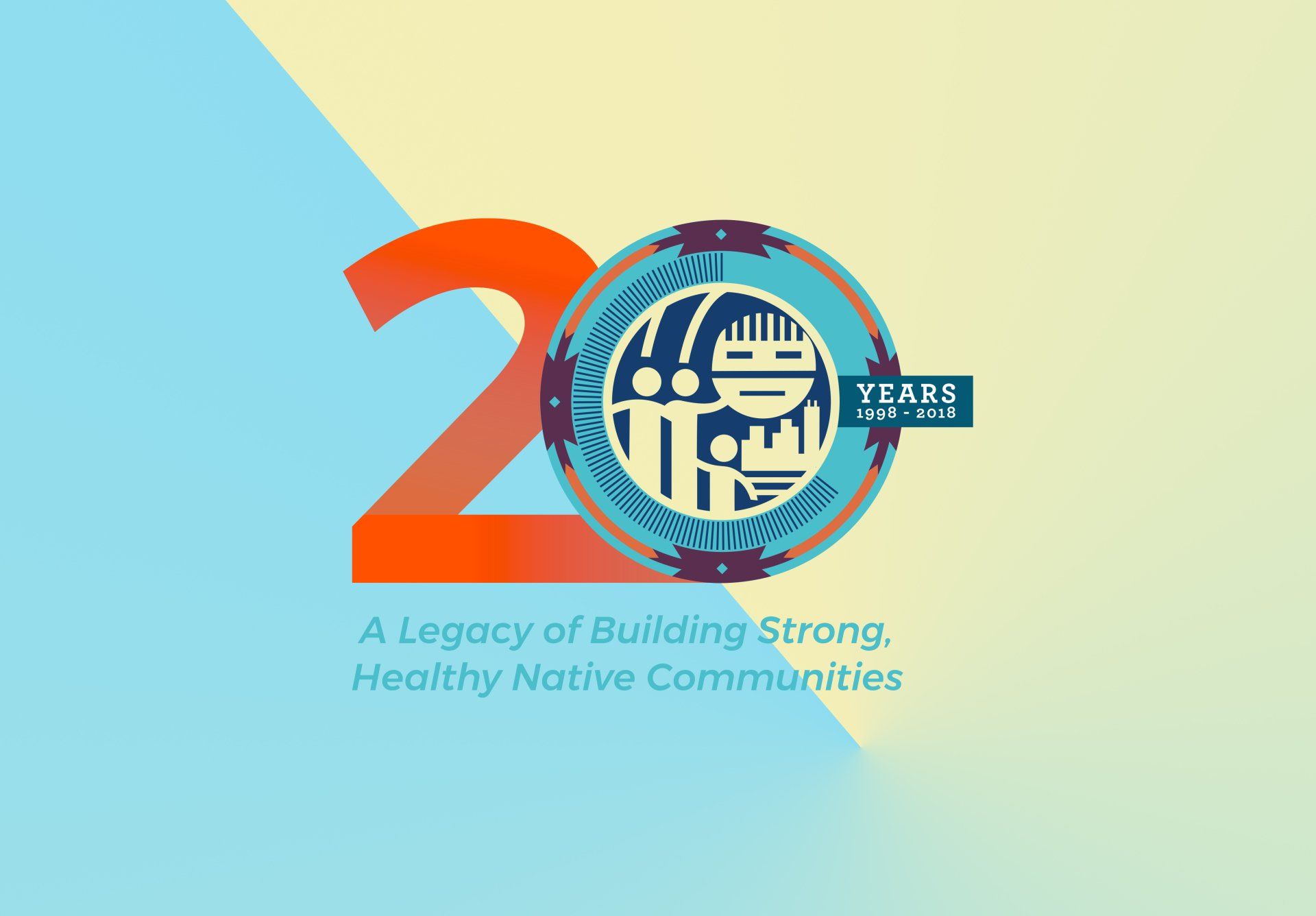
NCUIH 20th Anniversary Logo
NCUIH is a National 501(c)(3) organization devoted to the support and development of quality, accessible, and culturally-competent health services for American Indians and Alaska Natives living in urban settings. NCUIH envisions a nation where comprehensive, culturally competent personal and public health services are available and accessible to American Indians and Alaska Natives living in urban communities throughout the United States.

The Challenge
When we had gotten this project we were the second design group to work on it. NCUIH had a specific vision, but that was not initially translated in the design brief. We knew they wanted a logo that would really pop for their 20th Anniversary. We knew we had to step up the color and the design. Our inspiration for this project was music festivals, specifically electronic dance music festivals. We knew the pops of color, and use of shape would make for a logo that was sure to grab attention. The specific want from the client was not to have a logo that every other Native American organization has, they wanted to be unique.
What We Did
After conducting research, looking at inspiration from dozens of music festivals, and our own personal experience attending music festival, we had some initial concepts and color pallets to show the client. Their first reaction, this is a game changer! We worked with them to refine the color palette, toning down some initial vibrant colors to a warmer more flat color palette.
What We Achieved
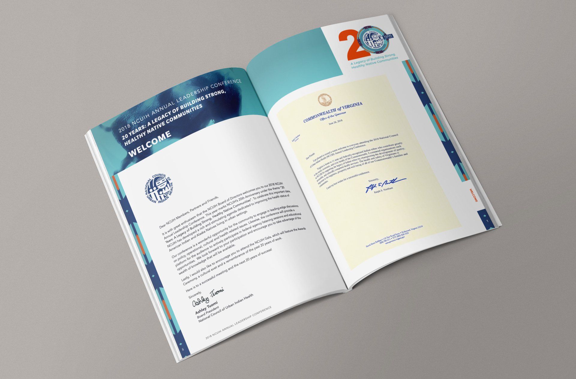
When it came to final product, we can firmly say the client was impressed. There was a tight deadline since this was used for their 20th Anniversary conference, appear on banners, posters, trade show graphics and the highlight of their conference booklet. At the beginning of the conference this booklet is handed out to everyone, the guest speakers first response after the opening remarks was to look at their booklets and see how great their anniversary logo looked. As a design group that makes the project all worth while. To hear that they stopped what they were doing to touch on the work that went into developing this was reward enough for what we did.
27K
LIKES, TWEETS, & SHARES
1,877
IMPRESSIONS
1,549
NEW CUSTOMERS